Visual Identity
The Eunoia Junior College Visual Identity embodies the college’s vision, mission, and values. The college crest, wordmark and combination marks are used to represent beautiful thinking, all-round development and cultural conversance in multiple environments and styles. This guide details the uses of the different logos.
College-appointed vendors and students should approach their Eunoia Junior College staff liaison for the Illustrator or high-resolution files for the purpose of production. Do not use or reproduce the identity elements featured on this page.
Crest
The Eunoia crest is the principal symbol of the college. The primary crest is applied in typical settings in Eunoia Blue. The secondary crest is applied in circular environments such as the college collar pin, badges, and social media profile images.
The Eunoia crest should be used with optimal readability and visibility in mind. The crest may also be used in combination with the wordmark, as seen in the combination marks below.

Wordmark
The Eunoia wordmark or logotype employs FF Mark to represent the name of the college in a stylised setting. It should not be recreated using word processing or design applications, or substituted with alternative representations.
It can be paired with the Eunoia crest in combination marks (see below). It can also be used as a standalone logo where the crest is already present. For instance, the crest is printed on the front of the college PE and polo t-shirts, with the wordmark appearing on the back of both.
A simplified wordmark, bearing only ‘eunoia’, may also be used in small-scale applications where the words ‘junior college’ may not be rendered clearly.

Combination Marks
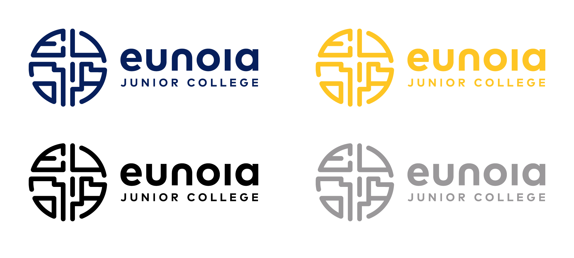
The Eunoia combination marks pair the Eunoia crest and wordmark in horizontal and vertical configurations. These are used when the name of the college is necessary for recognition by all stakeholders. The crest can only be paired with the wordmark, and authorised logotypes of departments, committees, and programmes.
The vertical configuration is applied in settings where the crest and wordmark are the main feature and symmetry is preferred. These include signage, name cards and presentation slides.

The horizontal configuration should be applied where a wide space needs to be filled or where there is limited vertical space. Examples of such environments include document headers, digital headers, graphical user interfaces and signage.


