Identity Guidelines
Visibility
The crest, wordmark, and combination marks should be presented for optimal readability.
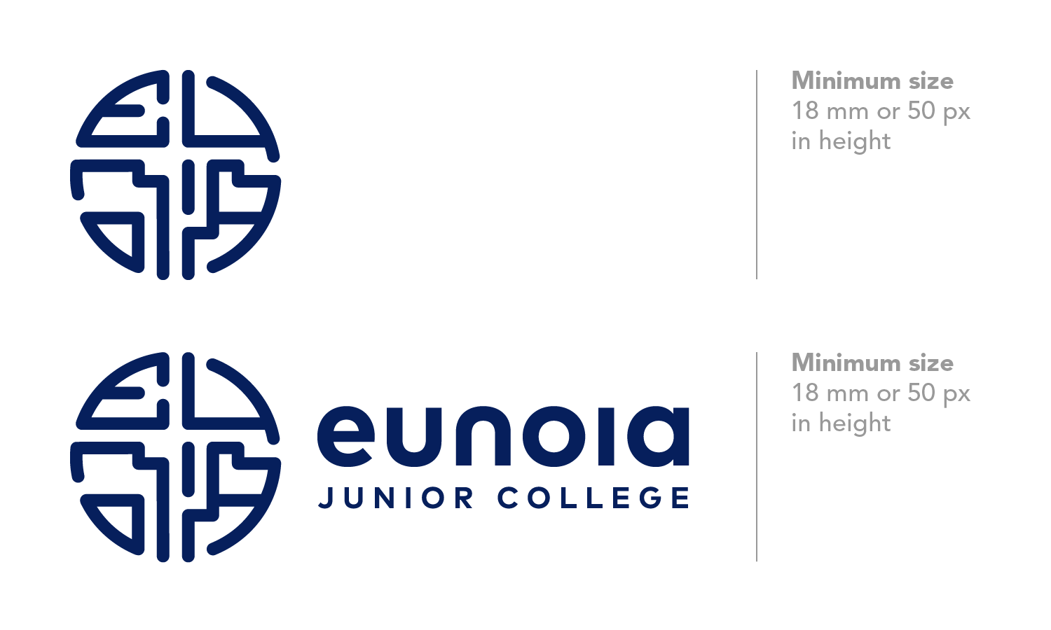
The crest and horizontal combination mark should be represented in a size no smaller than 18mm or 50px in height. The college recommends a size larger than or equivalent to 30mm height in printed applications.
The vertical combination mark should be represented in a size no smaller than 18mm or 50px in width. The college recommends a size larger than or equivalent to 30mm width in printed applications.
The crest must be represented in its full form at all times. Design elements within the crest should not be extracted and without authorisation by the college.

Clarity
The crest, wordmark, and combination marks should be presented distinctly and prominently in all applications.
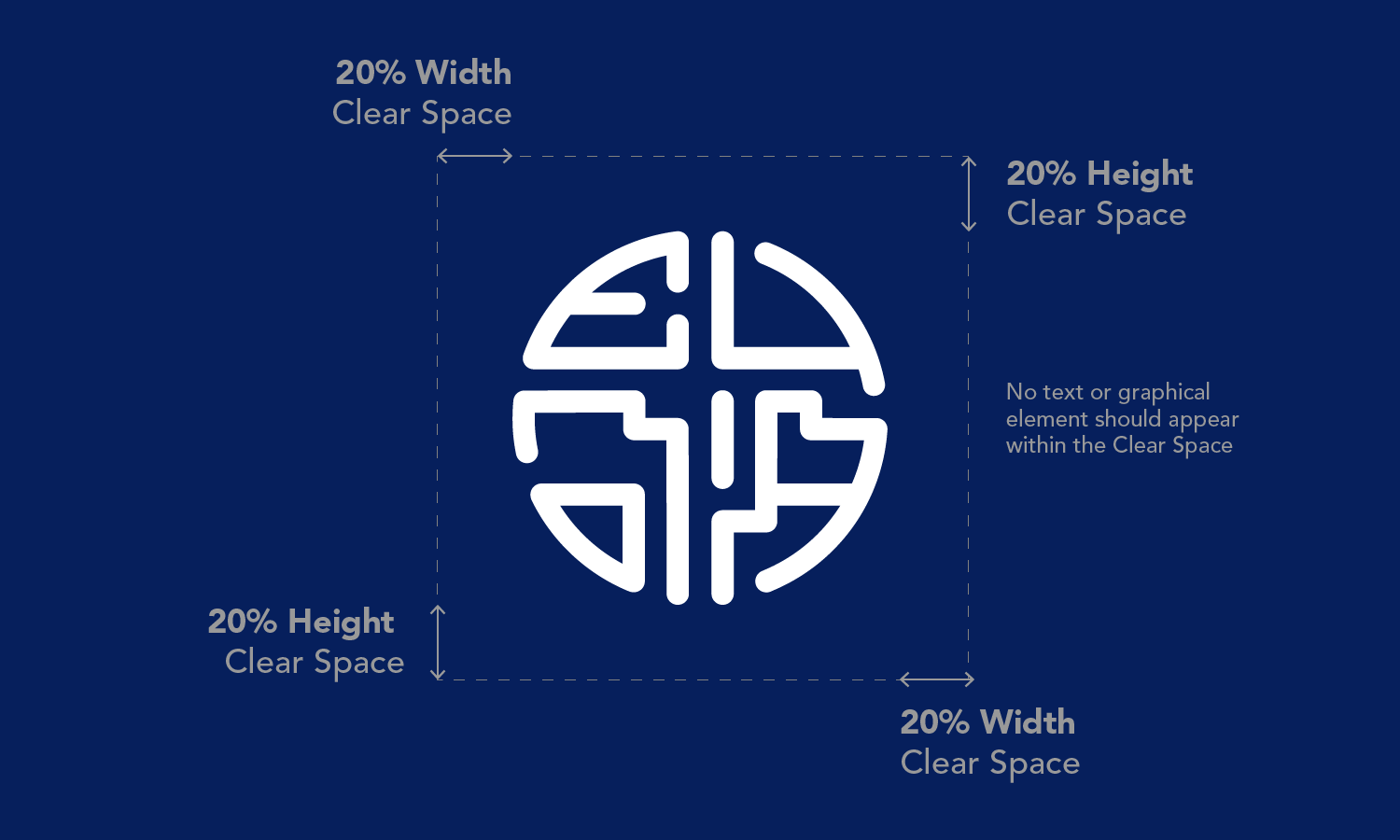
There should be a perimeter of 20% clear space around the aforementioned logos. All other text or graphical elements should be distinct from the crest, wordmark and combination marks, so that the college identity is clearly recognised by all stakeholders.

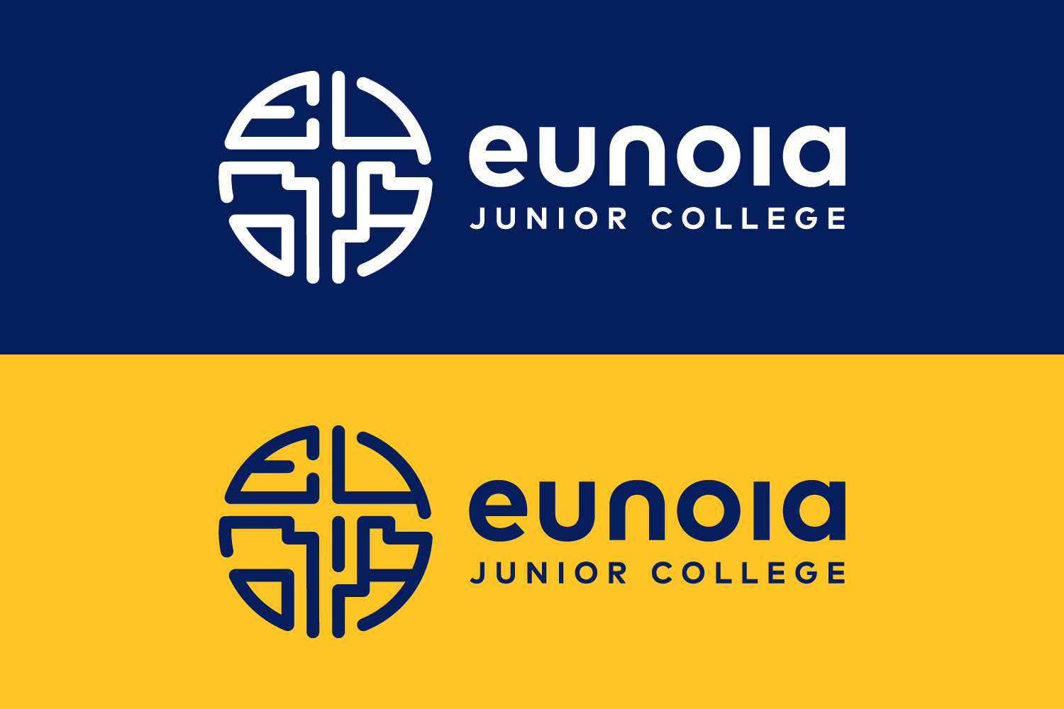
The crest, wordmark and combination marks should appear on backgrounds filled in college colours (blue, gold, white), grey or black.

The crest, wordmark and combination marks may be applied on photographic, patterned or textured backgrounds only if there is sufficient clearance space and contrast between the logo and the background.

Consistency
The crest should not be placed next to alternative representations of the words, ‘Eunoia Junior College’ in a different typeface, or next to recreations of the wordmark in FF Mark. This is to preserve recognition of the wordmark and coherence in the college’s visual identity.
In instances where the college name is required, use the horizontal or vertical combination mark, bearing the college wordmark ‘Eunoia Junior College’.
The crest should be presented in its correct orientation at all times. It should not be rotated, distorted or warped in any application.
Respect
The crest and combination marks represent the college and should be treated with respect in all environments it is applied on. It should not be directly printed on disposables (e.g paper cups, serviettes) or applications where the crest and combination marks can be stepped on or damaged (e.g. floor decals, doormats, sports equipment).
Creative uses and interpretations of the college’s visual identity (e.g. using the reversed crest as a typographic ‘O’) must be authorised by the college and conform to the Visibility, Clarity and Respect guidelines. The college reserves the right to reject applications that do not follow the aforementioned guidelines.

